
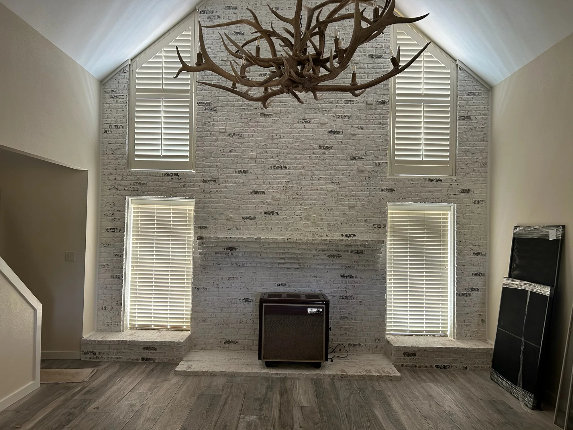
Why Picking a Blind Color Feels So Hard
Standing in a showroom looking at fifty shades of white can feel harder than picking paint. Blinds are a bigger commitment than a throw pillow. You are not swapping them out every year. So it makes sense that homeowners want one safe answer: what color just works, no matter what?
The good news is there really is an answer, or at least a short list of them. A handful of neutral colors have earned their reputation because they blend into almost any wall color, furniture style, and room. Once you know what they are and why they work, picking gets a lot easier.
The Neutral Colors That Work Almost Anywhere
Neutrals are popular for a reason. They do not compete with your decor, they let other colors in the room take the spotlight, and they age well instead of looking dated in a few years. Here are the ones we recommend most often.
- Bright white: Crisp and clean, white blinds work in modern homes, farmhouse style rooms, and anywhere with white trim or white ceilings.
- Warm white or cream: Slightly softer than bright white, this shade pairs well with warm wall colors and wood floors without looking stark.
- Greige: A blend of gray and beige, greige is one of the most flexible colors you can choose. It leans warm enough for traditional rooms and cool enough for contemporary ones.
- Natural wood tones: Light to medium wood or faux wood finishes bring texture into a room without adding a bold color statement.
Any of these four options will look right at home in nine out of ten rooms. That is exactly why they show up again and again in model homes and interior design magazines. They are not boring. They are dependable.
What If Your Walls Are a Bold Color?
Busy or bold wall colors are actually where neutral blinds shine the brightest. If your walls are a deep terracotta, sage green, or navy blue, a neutral blind lets that wall color stay the star of the room. Matching the blind color too closely to a bold wall can make a window disappear into the wall, which sounds nice in theory but often just looks flat in person.
A simple rule of thumb: the busier or bolder your walls and furniture already are, the more neutral your window treatments should be. Save the bold color choices for pillows, art, and accent pieces that are easy to change later. Blinds should be the steady background, not another loud voice in the room.
What If Your Decor Changes Often?
Some homeowners redecorate every few years. Others change out throw pillows and accent pieces all the time. If that sounds like you, neutral blinds are almost always the smarter long term choice. A warm white or greige blind will still look right after you repaint the walls or swap the sofa. A trendy colored blind might not.
Here in Southern Arizona, a lot of homes lean into warm neutral palettes already, things like tan, terracotta, sand, and soft browns that echo the desert landscape outside. Warm white and greige blinds tend to blend beautifully into that kind of interior, adding a clean finish without fighting the warm tones already in the room.
Should the Front of the House Match the Back?
From the street, most blinds and shades look best in a consistent, neutral color across all the front facing windows. This gives your home's exterior a clean, uniform look rather than a patchwork of different shades peeking out from different rooms. White, warm white, or a light greige are the safest bets for street facing windows.
Inside the home, you have more freedom to vary things room by room since only you and your guests will see them up close. A bedroom might call for a slightly different tone than a home office, and that is perfectly fine as long as each room's choice still feels neutral and calm rather than jarring.
Simple Rules of Thumb for Choosing
If you are still stuck, these guidelines can help you make a confident decision without overthinking it.
- When in doubt, go lighter. Light neutrals almost always look more expensive and more flexible than dark ones.
- Match your trim, not your walls. Blinds that match your window trim or ceiling color tend to blend seamlessly.
- Consider your light. Rooms that get strong afternoon sun can wash out very pale colors, so a warm white or light wood tone often holds up better than stark white in bright rooms.
- Bring home samples. Colors look different under your own lighting than they do in a showroom, so always test a sample against your actual walls before deciding.
Matt Diaz personally brings a full set of color and material samples to every free consultation, so you can hold them up against your own walls and furniture before committing to anything.
When It Is Worth Breaking the Rules
Neutral is a safe default, but it is not the only right answer. If you have a strong design vision, a bold color or pattern can look fantastic in the right room, especially in a powder room, a home office, or another space where you want personality more than flexibility. The key is being intentional about it rather than picking a bold color just because it caught your eye in the showroom.
If you are ever unsure, start with a neutral in the main living spaces where you spend the most time and want the most flexibility. Save bolder choices for smaller, more personal rooms where a style change later is a much smaller project.
Choosing a blind color does not have to be stressful. Stick with white, warm white, greige, or natural wood tones if you want a safe, timeless choice that works with nearly any room. If you would like a second opinion, or want to see samples in person against your own walls, we are happy to help. A short in-home visit is often all it takes to feel confident in your final choice.